Interperting the Data
Overview
This documentation aims to guide users in understanding and effectively interpreting radar data through the use of key components, including the color legend, radar product data, and the color graph within the scrubber bar.
1. Color Legend

The color legend serves as a visual reference to interpret radar data. Each color on the legend corresponds to specific data values, enabling users to quickly identify and comprehend the information presented in the radar scans. Familiarizing yourself with the legend is crucial for accurate analysis and informed decision-making.
2. Radar Data Visualization
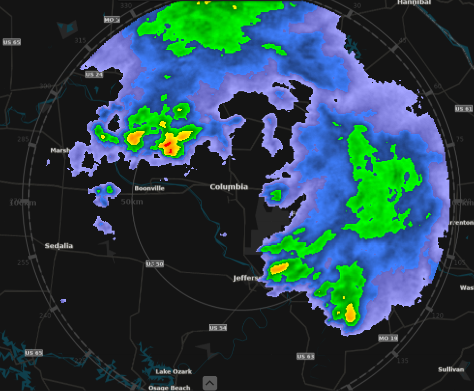
The heart of radar data interpretation lies in the visualization of data. We employ advanced visualization techniques to represent radar information in an intuitive and accessible manner. Users can explore detailed radar scans, identify patterns, and discern anomalies by closely examining the visual representation of data on the screen.
3. Color Graph in the Scrubber Bar

The scrubber bar, equipped with a dynamic color graph, enhances the user's ability to navigate through radar data efficiently. The color bars represent variations in data intensity over time or space, offering a dynamic view of changes. Users can adjust the scrubber bar to focus on specific timeframes or areas of interest, facilitating a more granular analysis of radar data.
How to Interpret Radar Data
-
Selected Product Type
- Select the radar product type.
- The selected product will determine the color legend, scrubber bar, and the units of measurement.
-
Refer to the Color Legend
- Identify the meaning behind each color in the legend.
- Associate colors with specific data values or categories.
-
Analyze Radar Data Visualization
- Examine patterns, trends, and anomalies in the radar data.
- Utilize zoom and pan functionalities for detailed exploration.
-
Utilize the Scrubber Bar
- Navigate through time or space using the scrubber bar.
- Observe changes in color intensity to identify variations.